Experiment Metrics
Compare two versions of search or browse on real shopper behavior — sessions, conversion, revenue and the queries that drove the change.
What it solves
Changes to search and browse — a new ranker, a different relevance model, a fresh set of linguistic overrides — look promising in offline tests, but the only honest answer to "did this make things better?" is real shopper behavior. Without an A/B view, teams either ship blind or fall back on aggregate dashboards that average the winners with the losers.
Experiment Metrics gives search owners a per-experiment view of how each version of the experience is performing against the one it's replacing. It puts the funnel side by side — sessions, click-through, add-to-cart, conversion, revenue — and points at the specific queries and categories that moved.
When to use it
- Rolling out a new search ranker — run the old and new version side by side on a slice of traffic before flipping the rest over.
- Evaluating a relevance model change — confirm the new model lifts conversion or revenue without trading off the zero-result rate.
- Testing linguistic overrides at scale — measure whether a synonym set or query rewrite actually improves performance on the queries it touches.
- Validating browse-page changes — category-page ranking and facets benefit from the same arm-vs-arm comparison.
- Catching regressions before full rollout — a small canary surfaces a problem on a few queries before it affects every shopper.
Key concepts
Experiment — a named comparison between two versions of search or browse. Each experiment declares a control arm, a test arm, a date range, and the segments to slice by.
Control arm and test arm — the two versions being compared. The control is the baseline (usually what's in production today); the test is the alternative being evaluated. Every shopper session is tagged with the arm it saw, so behavior can be attributed to one version or the other.
Segments — additional dimensions to slice metrics by, such as logged-in shoppers or sessions where a vehicle is selected. Each segment is reported separately so the experiment effect can be compared per audience.
Channel — whether a request was a keyword search or a category browse page. Most views can be filtered to search, browse, or global (both combined).
Query distribution (head / torso / tail) — every query is bucketed by how much traffic it carries. Head queries make up the most-searched ~50% of traffic, torso the next band, and tail the long list of rare queries. Slicing by bucket answers whether a change helped the popular queries, the long tail, or both.
Contamination — a shopper who sees both arms within a short window (a two-day attribution window) can't be cleanly credited to either. These mixed sessions are detected and dropped from the comparison so the numbers reflect a clean head-to-head. Typically a small share of sessions is affected.
Impact score — the ranking signal on the per-query and per-category views. It combines the click, add-to-cart and conversion differences between arms, weights them by the relative business value of each event, and shrinks the result against a baseline so a large percentage swing on a handful of requests doesn't outrank a steady gain across millions. Sorting by impact answers "which queries actually moved the needle?".
Traffic split — the share of traffic each arm received. The experiment definition records the intended split; the dashboard also shows the split actually observed in clean sessions.
Experiment Metrics surfaces raw KPI differences between arms. Statistical significance, confidence intervals and p-values are intentionally not part of the dashboard — they belong in a separate analytics layer where the test design, traffic split and minimum detectable effect can be modeled end-to-end.
How it works
Open Experiment Analysis from the platform menu. The landing page lists every experiment defined for the tenant; selecting one opens its dashboard, organized into four tabs.
Experiment list
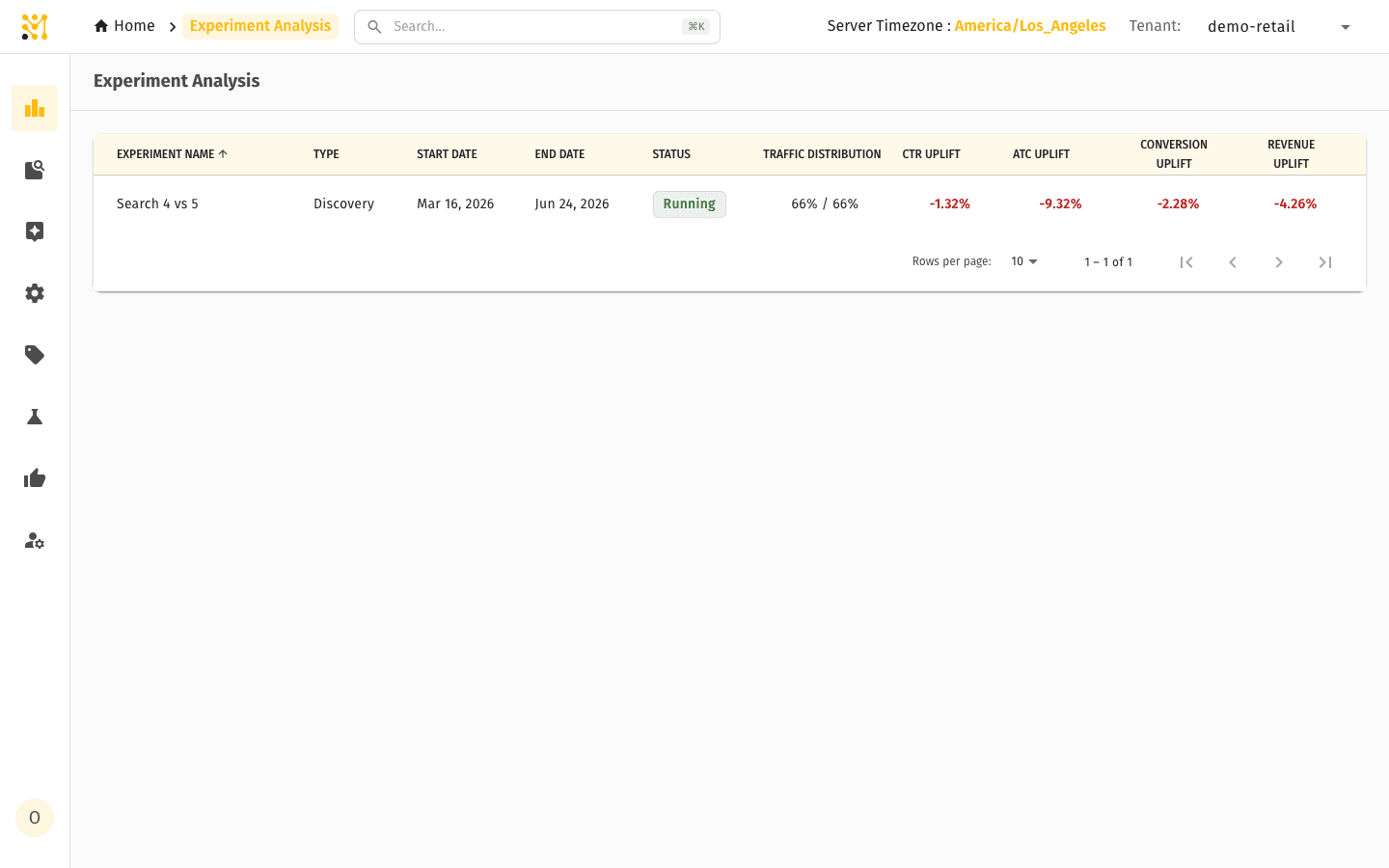
The list shows each experiment with its type, date range, status (running, paused, completed), traffic distribution, and a quick read on the headline uplift — CTR, add-to-cart, conversion and revenue — of the test arm versus the control.
Summary
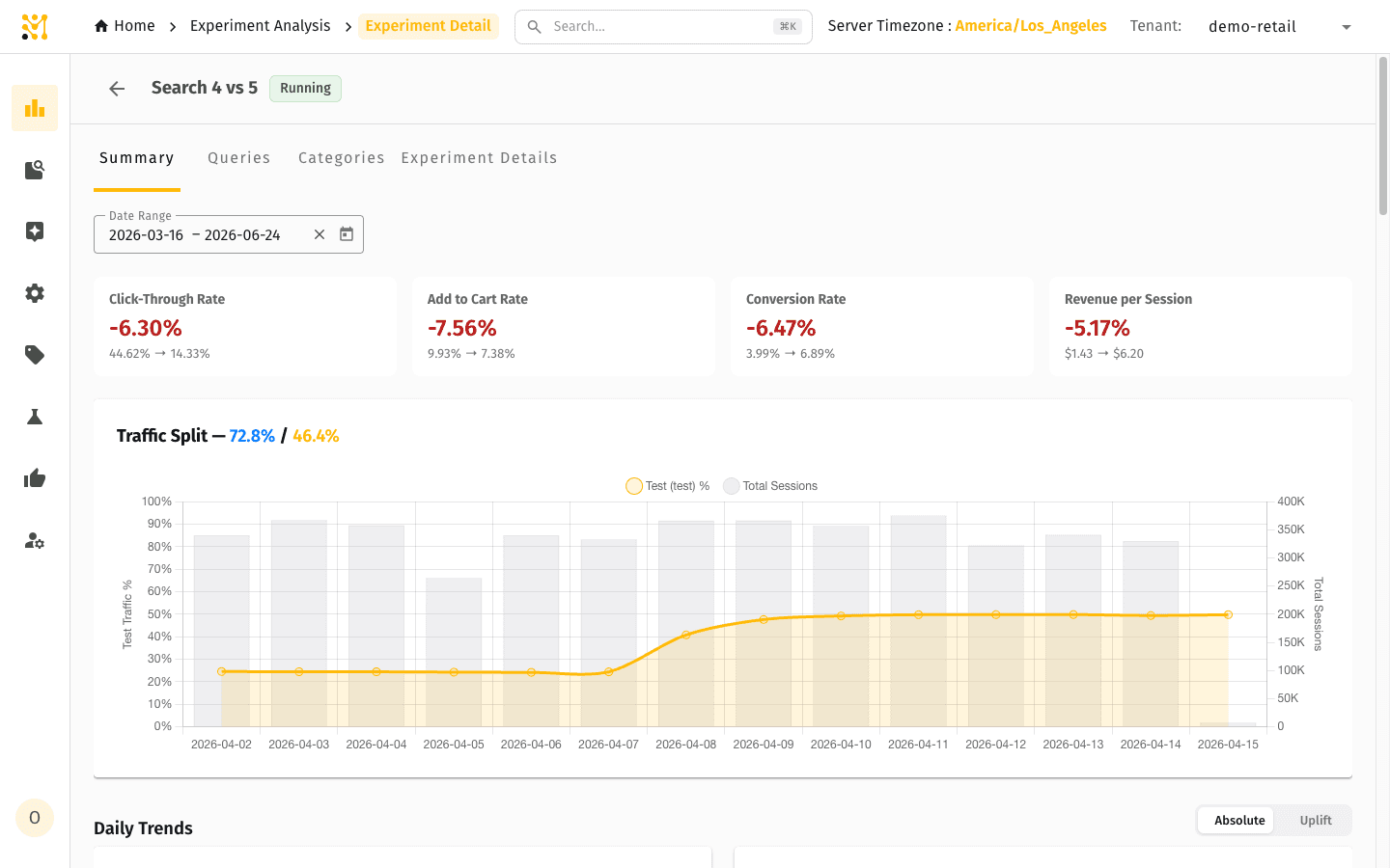
The Summary tab answers "is the test arm winning or losing?" at a glance. Four cards show the headline rates — Click-Through Rate, Add to Cart Rate, Conversion Rate and Revenue per Session — each with the percentage change and the control → test values. Below them, the traffic split and a set of daily trend charts let reviewers spot anomalies (a deploy that broke search for a day, a bot event that inflated traffic) and decide whether a day should be excluded.
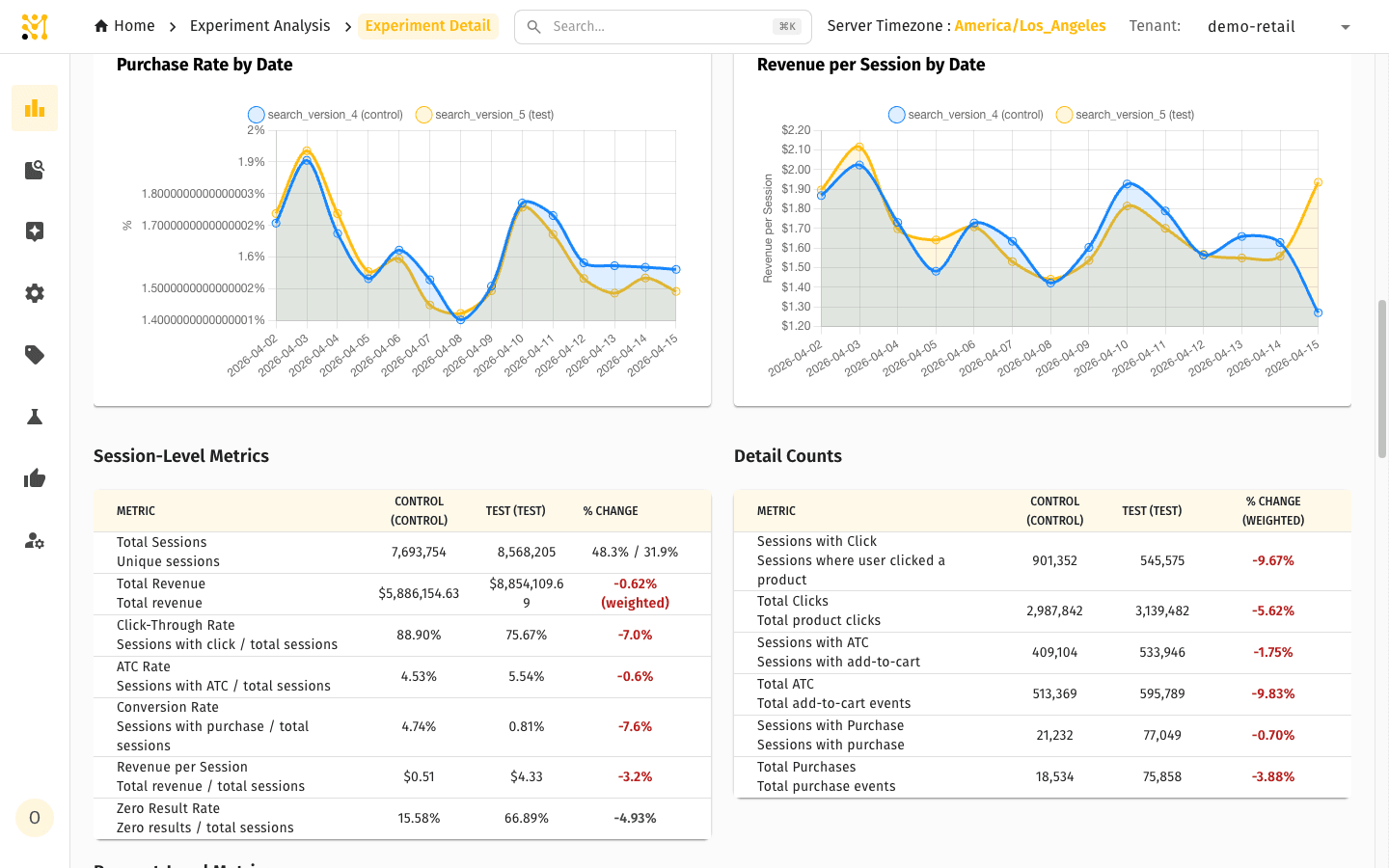
Further down, the Summary breaks the funnel into detailed tables: Session-Level Metrics (rates measured per session, with each metric's denominator spelled out), Detail Counts (the raw event counts behind the rates), and Request-Level Metrics split into Search and Browse so you can see whether a change moved one channel, the other, or both.
Use this tab to:
- Read the headline result in one glance.
- Spot day-level anomalies to exclude before drawing conclusions.
- See whether the change moved search, browse, or both.
Queries and Categories
The two drill-down tabs are usually the most actionable. Queries lists every search query that ran during the experiment, with each arm's funnel side by side; Categories does the same for browse category paths. Both are sortable by any KPI or by Impact, filterable by query distribution (head / torso / tail), and searchable by phrase.
Charts at the top summarize the biggest movers — the per-query purchase-rate and revenue-per-session change, and the uplift broken down by query type (head / torso / tail).
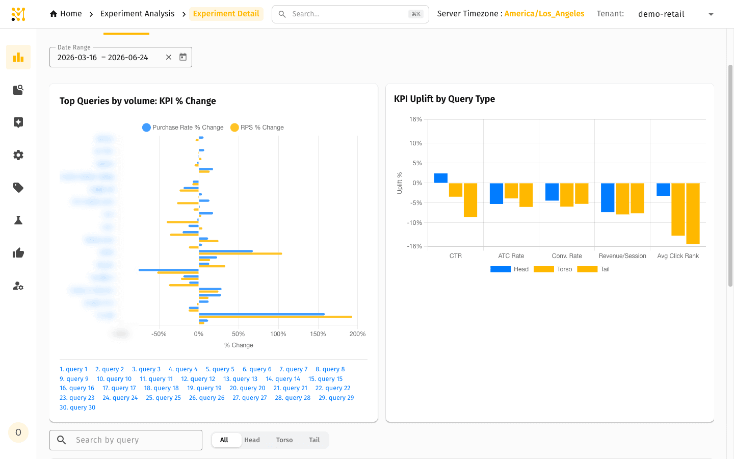
Below the charts, the table gives the per-query detail with each arm's funnel side by side.
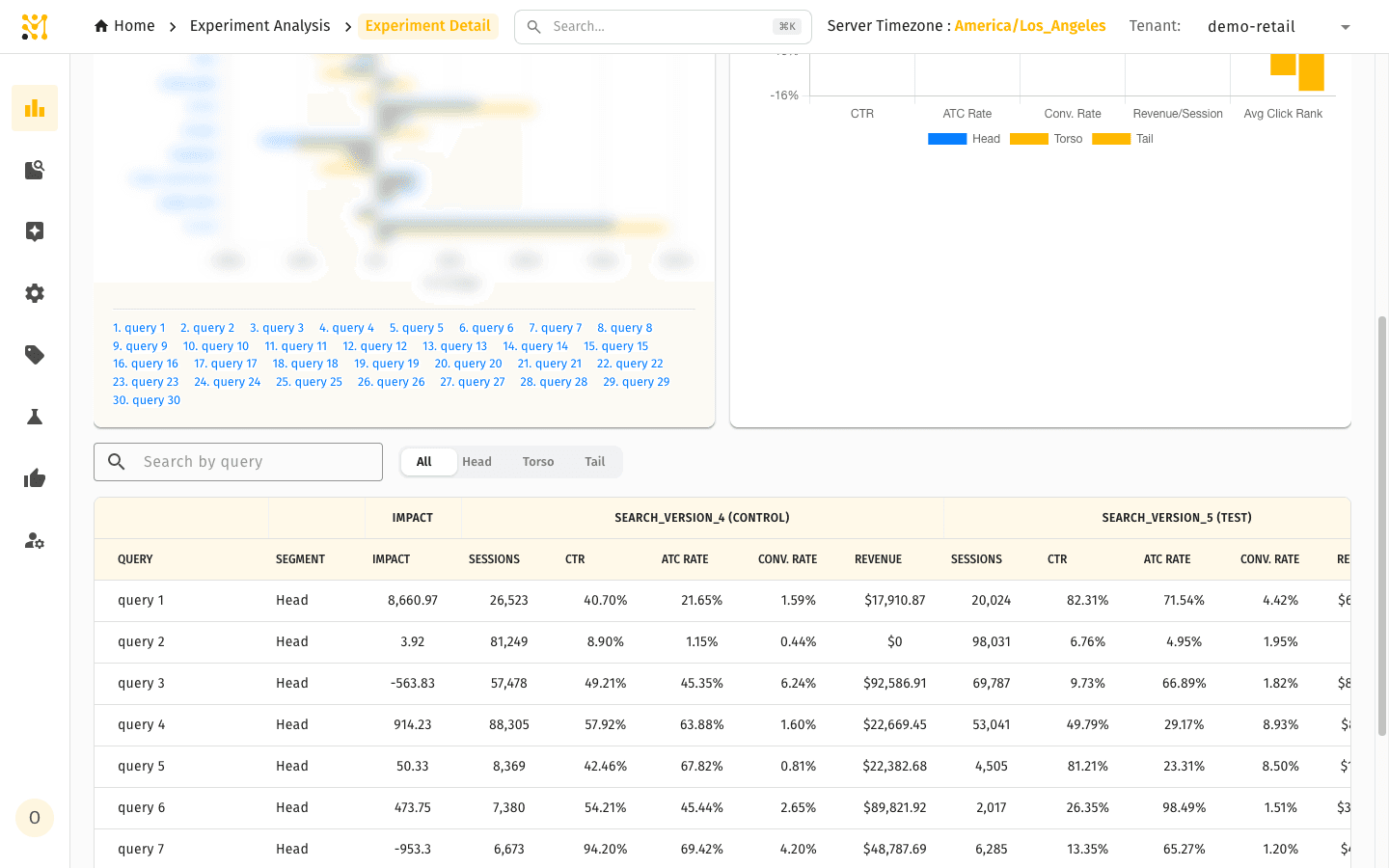
Use these tabs to:
- Find the queries where the test arm wins big — these justify the rollout.
- Find the queries where it loses — these need investigation first, and often point to a linguistic-override or merchandising fix.
- Confirm the impact is broad-based, not driven by a handful of queries.
Query details
Selecting a query (or a category) opens a dedicated details page that explains why that request moved between arms. It gathers everything about the single query into one view.
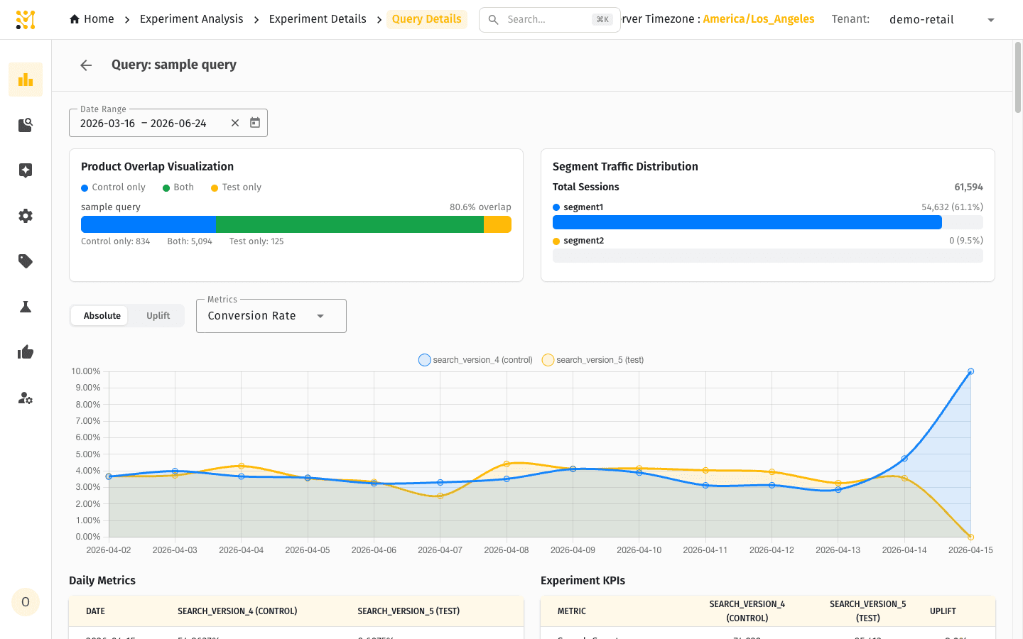
- Product Overlap Visualization — how much the two arms returned the same products for this query, split into control-only, shared ("both") and test-only, with the overall overlap percentage. A low overlap means the arms reordered or replaced a lot of the results; a high overlap with shifted rates means the change was at the margins.
- Segment Traffic Distribution — the share of sessions in each configured segment, so you can see which audience the query's traffic came from.
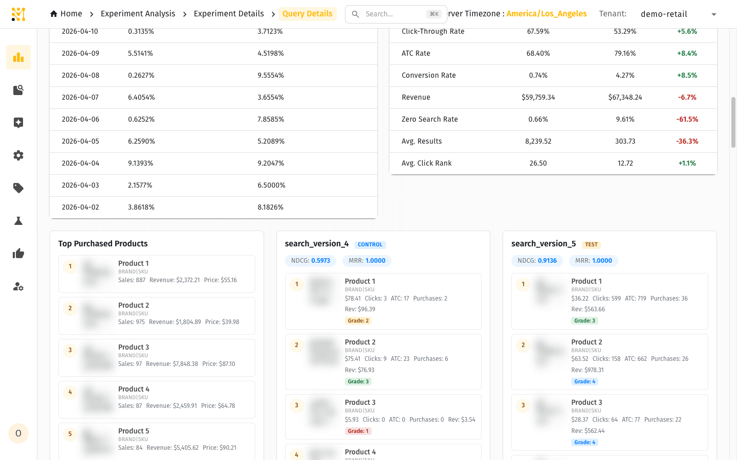
- Daily Metrics — a per-query time series for a chosen metric (conversion rate, CTR, and so on), with an Absolute / Uplift toggle and both arms plotted together. Use it to confirm a change is steady rather than driven by one day.
- Experiment KPIs — the full funnel for this query, control vs test vs uplift: search count, zero-result count, views, add-to-carts, purchases, CTR, add-to-cart rate, conversion rate, revenue, zero-result rate, average results and average click rank.
Below the charts, Top Purchased Products lists the best-selling products under each arm side by side — each with its clicks, add-to-carts, purchases and revenue, and a relevance Grade (0–4). When a graded relevance table is configured for the tenant, the page also shows search-quality scores (NDCG and MRR) for the result set. This is where you see, for example, that the test arm surfaced a higher-revenue product earlier, or pushed a high-relevance product down past the fold.
Experiment Details
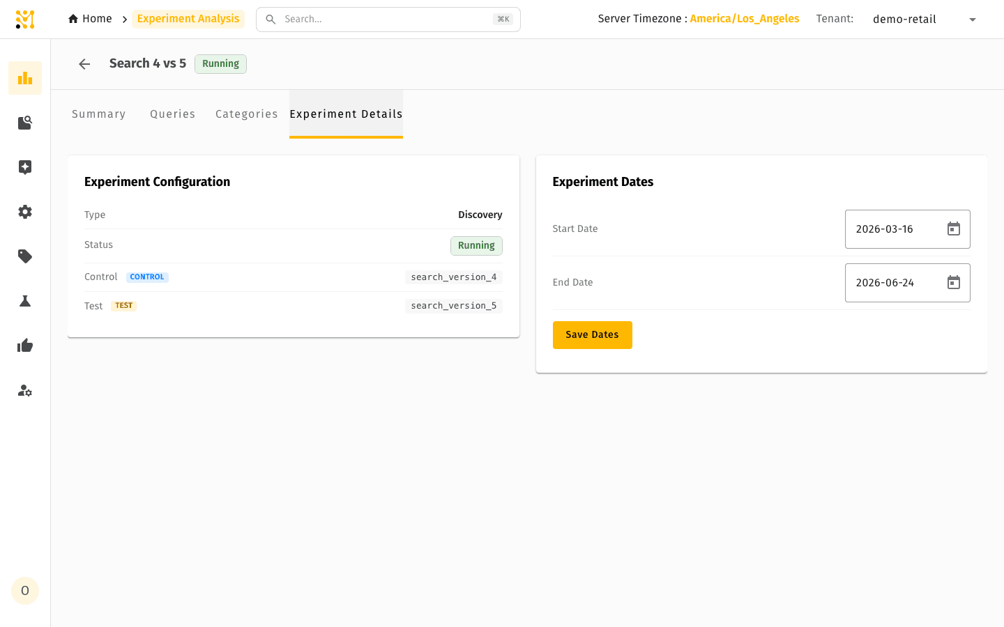
The Details tab shows the experiment definition — type, status, the control and test arm tags — and lets you adjust the experiment's start and end dates.
Quick example
A search team is testing a new relevance model against the current one on a slice of traffic. After two weeks they open Experiment Analysis, select the experiment, and start on the Summary tab: revenue per session, conversion and click-through are all down a few percent versus control. They check the daily trends and confirm the dip is consistent rather than driven by a single bad day.
They switch to Queries, sort by impact, and see the loss is concentrated in a cluster of head queries where the new model reordered popular results, while the long tail is flat. They open one of the biggest losers and review its product-level detail, confirming the test arm is over-ranking a low-converting product. They flag it for the merchandising team to address with a discovery rule before re-running the experiment — and hold the rollout.
Experiment Metrics is part of the full MXP platform and is not available in Lightweight mode. The standard Metrics dashboards are fully available in Lightweight mode.
Related pages
- Metrics — non-experiment search and browse performance metrics.
- Experiment Metrics — pipeline & architecture — how the data is computed, end to end.
- Experiment Metrics onboarding — enable the feature for a new tenant.
- Glossary — definitions for CTR, ATC rate, conversion rate, revenue per session, head/torso/tail, NDCG, MRR and more.
- Discovery Rules — act on per-query insights by boosting, burying or pinning products.